Friday 29 April 2011

This could be my longest post yet!!....

So whilst researching for my presentation (which i've literally been doing all day! grr!) i came across this guy : Anton Yang who makes little models and photographs them around the streets of Singapore. I won't say anymore, the images speak for themselves but they are very 'me' and just generally, massively, awesome!! =D


I could go on all day, there are loads of these photos but i need to be getting on! Check out his work though, it's definately worthwhile!

Monday 25 April 2011

Cardboard writing

As inspired by one of my previous artist posts, i decided to create some text to go alongside my boombox. I didn't want the letters to be neat or 'perfect' but to fit in with the 'work it out as i go along' technique i used for my previous piece. I'm not sure that worked out very well here, i don't particularly like the results but i'm glad i tried it out anyway and i might find a use for them later on.

I experimented with adding extra pieces (the 'r' in born) and then ripping and crinkling the cardboard to get additional textures. That's definately what i like most about corrugated card: the wide range of textures you can get from it and the fact you can use it to create almost anything.


I then photographed the letters on an old lined paper notepad. The pages have aged naturally and have a beautiful look to them, unfortunately the pad is A5 so i had to split the design up...


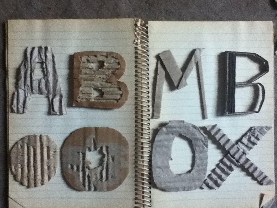
I like when text in books doesn't make immediate sense, instinctively we read left to right/top to bottom and that doesn't work here. I think this allows the letters to be seen as individual 'creations' rather than just to serve a purpose and also it takes a little longer to decipher the text.

The phrase says 'Born From A Boombox' which I stole borrowed from Step Up 3, to me it sums up how much music is a part of my life and despite being cheesy i think it works!...

Wednesday 20 April 2011

Finished Boombox

So 3 and a bit hours later, here is the finished product. I intend to take some better quality pictures but for now my trusty i-pod will do the job...


I'm pretty happy with how it's turned out and i've quite enjoyed not measuring every millimetre and being a perfectionist over every aspect! Perhaps that can be my aim for this Amercian project: 'Go with the Flow...' !

More cardboard boombox...

I think it's quicker to post my process on here rather than in my sketchbook, with taking photos, printing them out, cutting and sticking, analysing etc etc, you get my drift(!) so for now my blog will act as a 'work in process' digital sketchbook!...

That said, here's my current stage of the boombox, i'm quite happy with how it's coming out.


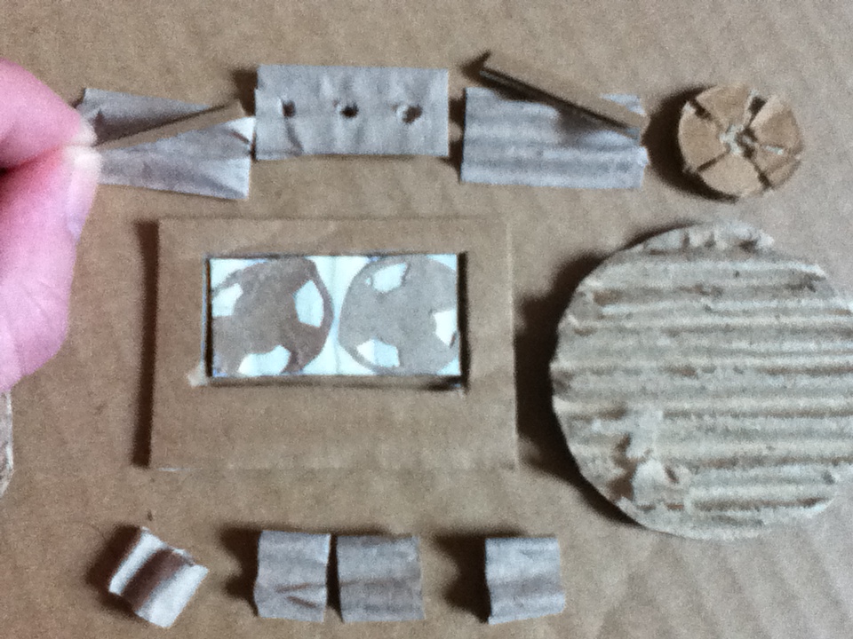
Im going to fix the dial gages (the piece im holding) upwards to give further depth -'3Dness'- to the box. 

I wanted to keep to texture of the card visible (on the main box piece) and it's worked quite well.


Nothing's stuck down yet, that could prove to be the trickiest part i think! But i've just got to make to handle and the top buttons and then i can fix it all together.


What are YOU upto right now??

Inspired by Yulia's 'recycle' typography (previously blogged) i've decided to use a similar technique to create a boombox from corrugated card, with accompanying text to follow. I've been working in a rough, just see-what-happens kind of way because i intended this to be the initial piece and then i'd re-create the final one. However i quite like the obvious hand-made effect it's having so i might -for once- not be so OCD about it and just see what happens!

Here are a few 'taster' photographs, more to come later!...

My workspace - all over the dining room floor!... Note: my zine from pick-me-up is a great reference with the boombox on the front, there was a purpose of me spending so long in the zine workshop!!
Speakers, tape-deck, main control buttons - what i've made so far...


To Be Continued...

Tuesday 19 April 2011

Life Saving website!

http://www.lostateminor.com/

Thanks to this website i have finally found my long short lost-for-some-time inspiration and i feel like when i get up tomorrow i might actually achieve something worthwhile!!

The content on the site is really extensive with fashion, sculpture, art, design, video, the list goes on. If you're bored or lacking motivation it's definately worth a visit. It's been my saviour!!

Large scale experiments


I'd like to try out working on a larger scale for the American project and i think this would allow me to be more experimental with paint, spray cans and various other materials. Having a larger canvas and working outside, throwing the paint on and being more 'free' could help loosen me up a bit and tame my perfectionism! It would hopefully produce some really interesting textures and results whilst being fun (and a great stress-reliever!) at the same time.

This piece is by Becki Wilson aka: Glitter Being

Simplicity is the key! (sometimes...)


I saw this on a t-shirt ages ago (but couldn't afford it!) and i thought it was brilliant. Light-hearted, simple and clever. Perhaps something i should bare in mind for my own work! I.e: don't overcomplicate everything!!!
It's by Christoph Nieman by the way, for any other Lego enthusiasts (haha) check out his "I Lego NY" project, again very simple but effective. Could be relevant to our current project too... =)

Why do i have to be so damn enthusiastic!?...

Yet another style i like, it's getting a tad frustrating liking everything i see! It would be nice, for once, to just loose interest..... haha.


These pieces are by Korean artist Minjae Lee and without sounding cheesy, i love the energy in them. The application of colour and sort of drawn-in collage works really well. This is another style i intend to use for ideas in my own work.

Love this style...

Rebecca Wetzler

This is an illustrative style i am eager to draw inspiration from, i always talk about appreciating rough line work and here is a brilliant example of how well it can come out. I also like how Wetzler combines pen, ink, crayon and uses a wide range of scribbles, continuous lines, ink splatters and watercolours. To me, this is what i see as 'exciting' illustration...


There is room to add text too, in a similarly 'scruffy' format...


Trying out a similar style in my own work will provide me with the excuse to experiment and practise more with using watercolours because at the moment, i pretty much suck! You have to start somewhere i guess!!....

Yulia Brodskaya

Yulia Brodskaya paper art

I've seen some of Yulia Brodskaya's work before but this piece particularly stood out for me, i love the aesthetics of corrugated, cheaply produced, throwaway card and this example shows how much you can do with it. I might try out something similar to use as an illustration for my American project. I really like the inclusion of the additional details: the ladders, the little signs, the recycling man, the miniature boxes. I think this is a really beautiful piece.